
Careful considerations for mHealth app development: lessons learned from QuestExplore
Introduction
Mobile health (mHealth) applications (apps) and smartwatches can be practical tools for collecting symptom and biometric data of persons living with serious illnesses (1). Patients can self-report symptoms, track their daily health behaviors, and monitor health information such as sleep data, activity, and heart function. However, challenges to optimize their usefulness exist, with most health related mHealth apps not including stakeholder input in the development of the technologies (2). Another challenge is that many apps are stagnant and unchanging, which can result in a “loss of novelty” or lead to device fatigue, where users become bored with the app and cease to use it. An additional challenge is ensuring that the data collected is stored and accessed securely in compliance with Health Insurance Portability and Accountability Act (HIPAA) laws. Finally, these apps can be expensive and time-consuming to develop, posing a challenge for projects with limited budgets.
Our team has been involved in multiple research studies to evaluate the use of mHealth apps and wearables for patients with chronic diseases (3-7). Most recently, our team’s mHealth research showed that it is feasible to obtain symptom data from children with serious illnesses using a smartphone app (Technology Recordings to better Understand Pediatric Blood and Marrow Transplant, TRU-PBMT) and a wearable device (6). The children in the study were ages 8–18 undergoing stem cell transplantation or cancer treatment. They were asked to record their symptoms in a study team-developed app daily and wear an Apple Watch to collect physiologic data daily. Results were encouraging, with the children recording in the app 63% of their days in the study and wearing the Apple watch 56% (6). Interviews were conducted at the end of the study, during which the children offered suggestions for improving adherence to reporting symptoms each day. Based on this feedback, the study team decided to re-design the app, entitled QuestExplore (QE), to increase symptom reporting for future studies. The purpose of this article is to describe the method of app development our multi-disciplinary team used to build a mobile symptom reporting app, including the critical steps necessary for success. The premise is that by creating a more dynamic and engaging app children will be encouraged to increase their daily symptom reporting which, in turn, will increase clinician awareness of symptoms and enhance communication between children and their clinician, and lead to better management of their symptoms during treatment.
Methods
The study was conducted in accordance with the Declaration of Helsinki (as revised in 2013). The study was approved by institutional review board of Duke University Health Systems (No. IORG0000087) and informed consent was taken from all the patients.
Our multidisciplinary design team for QE included: a physician-researcher, a nurse scientist, nurse practitioners, nurses, research assistants, software developers, child-life specialists, a hospital-based teacher, and a music therapist. A user-centered design (UCD) approach, an evidence-based process informed by the needs and understanding of the end-users (8), was used throughout the three phases of development (Figure 1). Stage 1 involved interviewing former study participants and engaging in discussion with groups of healthcare clinicians to obtain information regarding what features should be included in the app, what young people find interesting and engaging today, and even what they would find helpful to include in the app for their provider role. Stage 2 focused on designing and developing the QE app using phase 1 feedback. Stage 3 centered on testing the design and features of the QE app through iterative beta testing.

Stage 1: clinician and child feedback
Following institutional review board (IRB) approval, stage 1 involved interviewing 14 children (ages 8–17 years) from our prior study who had recorded symptoms in the smartphone app, as well as five clinicians who met with the app design team (6). These groups provided verbal and written feedback, summarized in Figure 2, on aspects of a mobile application that they felt would enhance the experience of using the app. These interviews were conducted by a qualitative researcher from our study team. The researcher conducted the face-to-face semi-structured interviews with the participants. Interview data collected were analyzed by three study team members utilizing conventional content analysis and NVivo 12 software to support the analysis (9). Our team also met with our institution’s IRB to gather feedback on necessary components for QE’s data storage and privacy.
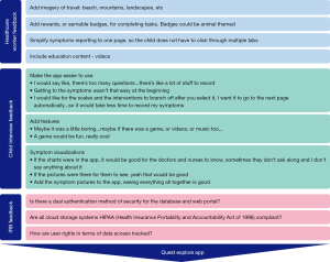
Stage 2: app design & development
Stage 2 involved taking the information gathered from interviews and group discussions with healthcare workers and conveying that information concisely to software developers. After evaluating the information collected from the interviews and group discussion, the app design team analyzed the responses and started development on a prototype, with three main focuses: an engaging user experience, modularity, and data security. Within the focus of engaging user experience, our team further broke this section down to the areas of prompting, gamification, data visualizations, developing an engaging user design, and condensing. These sub-categories were created based on stakeholder feedback during our interviews and were the most asked for enhancements to the original app (8).
In addition to interview feedback, group discussions found that stakeholders believed different areas of healthcare would be interested in using QE for their patients and would want different features. For example, the method of pain reporting in QE would need to vary by disease population. It would be important for children with sickle cell disease to record pain intensity, location, characteristics, duration etc. In contrast, children with gastrointestinal (GI) disease, the pain intensity over time would be important to know, but the granularity of the report on the pain was not as necessary. The need for customizations in the app as it was adapted for different populations of patients with chronic diseases led our team to build the app in a modular style. This modular building style was primarily executed by lots of organizational efforts, including consistent naming conventions, image and video management, and well documented code. Modular building in app development can be thought of similarly to shipping containers on a barge. In many apps, the code used can sometimes be unorganized, and resemble a barge in which all the materials being shipped are just mixed, laying on the ship with no organization. In modular style app building, we place related code into organized pages, like how items being shipped by a barge are placed into shipping containers. The major benefit in this modular style of coding, is that if a new user group wants an item removed, it is much easier to pick up the entire container or find the relevant container and adjust within. This allows for efficient changes and improvements thanks to increased organization early in the development process.
Stage 3: beta testing
A prototype of QE was developed, beta tested, and then shared with additional clinicians for feedback and suggestions. Clinicians completed the Mobile Application Rating Scale (MARS) survey, a 11-item survey which provides user feedback on mobile apps related to engagement, design, and usability. The app was then released to external beta testers, including the healthcare worker interviewees. Ten users were given the app to evaluate its ease of use and identify any additional errors or difficulties of use.
Results
Final product—QE
Through clinician, stakeholder, and IRB feedback, the multidisciplinary team along with software developers were able to develop the QE mHealth tool. The principal feature of QE is its “Symptom Journal”, a survey allowing users to report their current symptoms, moods, and medical interventions. Providers benefit from consistent and accurate symptom reporting, allowing them to better track patient symptom trends and patterns. In user interviews, users had two criticisms related to the design of our previous mHealth app; first it had too many pages, requiring too much interaction to log symptoms, and second, it lacked an engaging and dynamic interface. The key question to answer in redesigning the app was: how do you prevent an unchanging survey from becoming tedious, without compromising the data that you need? QE explores five solutions to address this question: prompting, condensing, “gamification”, data visualizations, and an engaging design.
Prompting
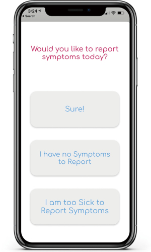
When a user opens QE for the first time in a day, a popup screen asks if they would like to report their symptoms, which serves as a daily reminder to the user to complete their symptom log. In previous iterations of the app, clinicians struggled with the ambiguity surrounding a lack of data in cases where the children were too sick to report or had no symptoms to report. This popup thus also includes the options, “I have no symptoms to report” and “I am too sick to report symptoms” (Figure 3).
Condensing
The “Symptom Journal” was condensed to a one-page scrollable survey, reducing the amount of time the child spends reporting and allowing the user to view the entire survey and its length at the outset, scrolling down rather than moving pages to see it. This condensing was done to make the symptom logging process more manageable and less cumbersome. In addition, the slider tool used to rate an individual’s symptom was hidden until the user clicked the symptom, once again saving space and streamlining the symptom reporting process.
Gamification
Gamification, or the process of applying gamified design principles in non-game settings, became one of the methods to engage children to continually report symptoms. QE’s badge system was inspired by one interviewee wanting to “win points” (Figure 4). As users accomplish goals, ranging from consecutive reporting in the app to interacting with the app’s creative content, they are awarded badges. QE also incorporated videos and content from the Greensboro Science Center (GSC) as a reward for consecutive reporting in the app.

Data visualization
QE also features a “My Data” page (Figure 5) to visualize user symptomatology, activity, and mood. The team created data visualizations using Apple CareKit and ResearchKit, partner tools of Apple HealthKit, which provide bar graphs and line charts that can be easily integrated into the app. QE’s symptom visualizations are helpful to providers and parents, presenting an overall picture of what the user is experiencing.

Engaging design
QE is designed to be vibrant and inviting, with the goal of increasing user engagement and appealing to the varying developmental levels of children in the study whose ages ranged from 8–18 years of age. As bright colors can frequently “distract” the eyes of the user and cause low readability and “eye strain” (10), highly saturated colors (pure hues) were replaced with an off-white background, off-black text, and desaturated colors. QE also includes a variety of animations to increase engagement. These were created using Lottie, an open-source animation file format created by Airbnb that can be rendered on mobile and web platforms.
The “Symptom Journal” page features a sliding bar scale (Figure 5) to report both the intensity and the distress level of a particular symptom in one place, which allows for capturing two different dimensions to the symptom to better understand how the symptom was affecting the patient. Many of the interviewees also expressed an interest in using emojis to report on their symptoms or mood, which inspired QE’s mood scale (Figure 5). Replacing text with familiar images can make the survey more quickly and universally understandable, with the effect of increasing engagement and reducing the amount of time logging symptoms by reducing the amount of time spent reading.
Modularity
Most mHealth tools are built for a very specific population or disease, which frequently results in a stagnant mHealth platform with a very narrow use case, and major reconstruction is needed if any app changes are required. QE is built in a modular style that allows for efficient changes with very low risk of damaging the app overall, which allows the app to easily adjust to the needs of the user. The modular style can be compared to shipping containers on a barge. The shipping containers can be taken off and added back on to the barge to move products (in this case information and data) to and from their desired locations.
Data security
An integral part of mHealth tools is data security, to which there are three key factors to consider: data structure, authentication, and the system’s architecture. All must be HIPAA compliant. For its data structure, QE practices the following: (I) only storing necessary data, (II) only accessing necessary data, and (III) never storing Protected Health Information together. While most apps allow any users to onboard themselves, QE onboards its users internally, to easily limit and maintain the user pool, and as a method of ensuring that usernames are non-identifying. Finally, QE’s system architecture (Figure 6) was designed in accordance with HIPAA guidelines, making use of open-source and HIPAA-compliant platforms such as Apple’s mHealth frameworks, Parse Servers, Amazon Elastic Beanstalk and Elastic Computing (EC2), and MongoDB.
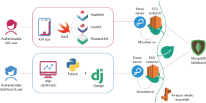
Apple HealthKit is a good starting point for iPhone Operating System (iOS) developers, allowing apps to integrate with Apple Health and pull health and fitness data gathered by the user’s wearable devices. QE’s mobile app and web dashboard each communicate with a respective Parse Server, an open-source backend developed by Facebook that provides services such as user authentication, session management, and tools for data management and manipulation. Each Parse Server is mounted on an EC2 instance, a virtual server allowing Parse to execute its functions in the cloud. To simplify management, these instances are contained within Amazon’s Elastic Beanstalk environment. The data collected by QE is housed in a database powered by MongoDB, a secure and easy-to-use database platform with which Parse was designed to communicate.
Discussion
The development of mobile applications in healthcare is becoming increasingly common and useful to understanding disease and symptom experiences in people living with chronic illness. We describe our steps to take on the development of a mobile app and provide the lessons we learned along the way. QE includes symptom reporting, gamification, education, animations, Apple Health Kit Integration, and methods to acquire and capture a variety of biometric values from smartwatches. In the process of developing QE, there were several lessons that we found are quintessential for others to follow prior to initiating the development of a mobile app. These lessons aim to reduce the cost and time required to develop a mHealth tool.
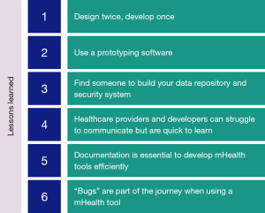
While software development teams may already be familiar with these lessons, the joining of software development and healthcare teams presents an opportunity for collaboration. Development of an mHealth tool provides a unique chance at utilizing differing strengths of a interdisciplinary team to provide a vector of communication and information regarding someone’s health or condition. Our entire team learned many lessons throughout this process, and the lessons learned aided throughout the development process of QE and will aid the development of future advancements to the QE platform (Figure 7).
Lesson 1—design twice, develop once
When developing a mHealth tool, designing visuals for the app streamlines development to save time and money. Having a straightforward design before the initiation of development can “shorten timelines” and provide “an increased chance of a successful project” (11).
Communication errors are frequently seen between developers and users and can lead developers to be “unsuccessful” regardless of the development method the team decides to use (12). Completing a full outline of a mobile application, or storyboarding, can aid developers in understanding the goals of the user interface before writing code (13). Priority and ample time should be given during this creative storyboarding process to ensure the developed output is as intended.
Building out a design for an app is an iterative and time-consuming process. Spending the time on the design prior to the development will drastically save costs. Changes to the app design stage will take less time when compared to making changes to lines of code after development.
Lesson 2—use a prototyping software
Prototyping tools, or app design tools, are cost-effective and easy to use, providing healthcare workers with the ability to visualize their wants in a mHealth app. In the initial stages of QE’s development, the timeline significantly increased due to conflicting app features and designs. After deliberation, the healthcare team became aware of the need to create a visual storyboard. The healthcare team and developers laid out each page of the app with content, buttons, and transitions in place. With a storyboard, communication became streamlined because the visual representation better conveyed the conglomerate of ideas and thoughts brought on by the healthcare team. The storyboard provided a visual guide for developers and removed ambiguity.
Utilizing prototyping software is essential in the “identification of usability problems” prior to the initiation of development (14). When usability errors are pushed through to development, the time it takes to correct the error is much greater than if the error was corrected during the design stage when developing the prototype.
Lesson 3—find someone to build your data repository and security system
With an increasing interest in mHealth tools and their implementation in hospitals and clinic settings, increased attention on data security and HIPAA guidelines must be one of the top priorities for your team. HIPAA requires various tools to be used when using a mHealth app but does not provide which tools one should use. In general, HIPAA requires a method of dual authentication, a program that tracks who views data, a HIPAA compliant server system, a HIPAA compliant storage system for data, and password protection (Health Insurance Portability and Accountability Act of 1996, 45 CFR 160, 162, 164). First, your team should prepare a budget and amount of time for consultation with a cyber security specialist. Your cyber security specialist should understand requirements for your institution, allowing them to pick the tools that best work for your mHealth tool.
Developers and cyber security specialists have very different skill sets. The team’s cyber security specialist was fundamental since our developers did not know the exact cyber security tools needed. While hiring or consulting with a cyber security specialist will incur costs, it is an essential step to receive approval from IRB. Exercising every precaution when handling user data is a key consideration.
After a conversation with our cyber-security specialist, our team decided to use Amazon Web Services (AWS) tools. This decision based upon several aspects. AWS is currently utilized in over “190 countries” and has been “rapidly growing” every year (15). AWS allows users to start at a free tier, providing a space for experimentation during your beta testing phase. In addition, Elastic Computing Cloud (EC2), a server tool provided by AWS, has integrations that once added, is considered HIPAA compliant. Other tools added include Cloudwatch from AWS, which tracks users as they enter our data dashboard.
In general, these tools are part of a larger group of formal verification tools, used to ensure security in a variety of digital settings. Regardless of the tool you decide to use, the tools are “hard to use” without experience using the tool, and further the need for a cyber-security specialist on your team (15).
Lesson 4—healthcare providers and developers can struggle to communicate but are quick to learn
The QE team’s goal when building our app was to include stakeholders at every possible facet we could. The stakeholder groups are vital to “design development and implementation” of an mHealth too (16). QE’s stakeholders included children living with chronic illnesses, doctors, nurses, child-life specialists, and music therapists. Communication amongst the various stakeholders and the development team often led to errors arising in the design or functionality in the app. One example of such communication error was in the development of a notification card in QE that reminded users to report their symptoms (Figure 8).
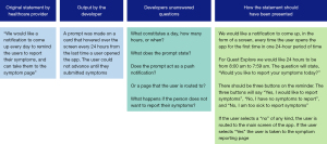
Communication errors between any client and developer happen for a variety of reasons. In many instances, the user group does not have a “clear idea” of what their user base needs (17). Frequently through QE’s development path, the team made changes based upon new information or changes in opinion for what best worked for their population. In addition, developers and clients can struggle to communicate openly, as lack of time or resources can frequently lead to a lack of “security” and “trust” between the client and developer (17). Without streamlined and efficient communication between the developer and client, improvements, communication can be challenging. Improved communication and building strong relationships between developers and client results in enhancements to the tool in an “optimal and efficient way” (17).
To improve communication lines between our healthcare team and the developer team for QE, both teams spent time expressing their modes of communication from their fields of work. Our healthcare team requested that the programming team comment on certain enhancements that would increase the development timeline, or likely result in “bugs” (18). Our development team requested that we stop making changes during meetings by voice, and instead work on flowcharts and diagrams to explain the development goals. Utilizing flowcharts resulted in the healthcare team finding enhancements that needed more explanation and were able to add it prior to developer handoff.
Lesson 5—documentation is essential to develop mHealth tools efficiently
When conducting a research study, replication is always a goal. This can be enhanced by methodological, thorough documentation designed to “help people understand code” (19). Documentation can include notes from meetings, code snippets, sketches, and flowcharts developed for the app. Documentation created serves programmers and users currently services using the app and aids the “transition” as new team members and new programmers join the team (19).
One area in QE’s development that benefited greatly from documentation was HIPAA compliance and data management. Having extensive documentation for these complex processes allows the developers to easily reference material for fixes or changes, and new developers have information on current app processes.
Software documentation is a long and cumbersome process, so developers should develop their documentation while they write code. While in the initial phases of mHealth tools development, this may take time away from the tool’s output. The benefit comes by allowing new developers to quickly orient themselves to your tool once built and allow current developers to reference their work before making improvements.
Lesson 6—“Bugs” are part of the journey when using a mHealth tool
“Bugs” are how developers refer to “imperfections or deficiency in a work product where that work product does not meet its requirements or specifications and needs to be either repaired or replaced” (18). Bugs are part of the journey of planning, developing, and utilizing a mHealth tool. With QE, the team wanted to use many different components, integrations, software, and features in our tool. In some cases, bugs arose from developer lines of code, but in many cases, integrations, changes to security protocols, and even updates to the phone and watch itself created bugs (18).
One way to manage bugs as they arise is to ensure previous app iterations are saved on a repository such as GitHub. As changes and updates are made, regressing to a previous version of the app may be the best solution to manage bugs that arise. In addition, we suggest that you always have a backup plan for essential items in your mobile app. In QE, collecting data from Apple Health Kit was highly important, and a bug early on resulted in missing data. Our team used Apple Health Kit because we could export that data from the phone locally if we could not find the data on our dashboard remotely.
Spend time planning for bugs during the deployment process of your app, but bugs should not take away from the successful deployment of your app.
Conclusions
mHealth is increasingly used as a tool to help obtain useful symptom and physiologic data on people with a variety of medical conditions. Our research team has currently implemented QE successfully to collect symptom and physiological data and engage users by providing entertainment, gamification, and other relief methods during their treatment. mHealth tools, like QE, are massive undertakings and require a multidisciplinary team to build and successfully deploy. Further research should be conducted on enhancing the communication methods between healthcare providers and developers as mHealth tools continue to become more integrated into healthcare. In addition, further research on quickly changing security features of databases to adhere to changing HIPAA guidelines should be conducted. Overall, QE was built to effectively improve communication of the disease experience. The lessons from QE’s development process will be essential for others to create new mHealth tools and enhance current ones. Currently, QE is currently being used at both Duke University and the University of North Carolina at Chapel Hill and will soon be used in (Amsterdam University Medical Center) in Amsterdam.
Acknowledgments
Funding: None.
Footnote
Data Sharing Statement: Available at https://mhealth.amegroups.com/article/view/10.21037/mhealth-21-51/dss
Conflicts of Interest: All authors have completed the ICMJE uniform disclosure form (available at https://mhealth.amegroups.com/article/view/10.21037/mhealth-21-51/coif). AS and EH both report that they are owners of QuestExplore Inc. NS has grant funding from the National Institute of Health (NIH), Patient-Centered Outcomes Research Institute (PCORI), Global Blood Therapeutics (GBT), and Novartis. NS is a consultant for GBT, Novartis, Emmaus Medical, and Forma Therapeutics. NS has also received honoraria for lectures from GBT, Novartis, and Alexion. The other authors have no conflicts of interest to declare.
Ethical Statement:
Open Access Statement: This is an Open Access article distributed in accordance with the Creative Commons Attribution-NonCommercial-NoDerivs 4.0 International License (CC BY-NC-ND 4.0), which permits the non-commercial replication and distribution of the article with the strict proviso that no changes or edits are made and the original work is properly cited (including links to both the formal publication through the relevant DOI and the license). See: https://creativecommons.org/licenses/by-nc-nd/4.0/.
References
- Montgomery K, Chester J, Kopp K. Health wearables: Ensuring fairness, preventing discrimination, and promoting equity in an emerging internet-of-things environment. J Inf Pol 2018;8:34-77.
- Larson RS. A Path to Better-Quality mHealth Apps. JMIR Mhealth Uhealth 2018;6:e10414. [Crossref] [PubMed]
- Anderson LM, Leonard S, Jonassaint J, et al. Mobile health intervention for youth with sickle cell disease: Impact on adherence, disease knowledge, and quality of life. Pediatr Blood Cancer 2018;65:e27081. [Crossref] [PubMed]
- Shah N, Jonassaint J, De Castro L. Patients welcome the Sickle Cell Disease Mobile Application to Record Symptoms via Technology (SMART). Hemoglobin 2014;38:99-103. [Crossref] [PubMed]
- Vaughn J, Shah N, Jonassaint J, et al. User-Centered App Design for Acutely Ill Children and Adolescents. J Pediatr Oncol Nurs 2020;37:359-67. [Crossref] [PubMed]
- Vaughn J, Shah N, Docherty SL, et al. Symptom Monitoring in Children With Life-Threatening Illness: A Feasibility Study Using mHealth. ANS Adv Nurs Sci 2021;44:268-78. [Crossref] [PubMed]
- Vaughn J, Gollarahalli S, Shaw RJ, et al. Mobile Health Technology for Pediatric Symptom Monitoring: A Feasibility Study. Nurs Res 2020;69:142-8. [Crossref] [PubMed]
- Farao J, Malila B, Conrad N, et al. A user-centred design framework for mHealth. PLoS One 2020;15:e0237910. [Crossref] [PubMed]
- Vaughn J, Kamkhoad D, Shaw RJ, et al. Seriously ill pediatric patient, parent, and clinician perspectives on visualizing symptom data. J Am Med Inform Assoc 2021;28:1518-25. [Crossref] [PubMed]
- Albers J. Interaction of color: New complete edition. New Haven, CT: Yale University Press; 2013.
- Roth WR, Vilardaga R, Wolfe N, et al. Practical considerations in the design and development of smartphone apps for behavior change. J Contextual Behav Sci 2014;3:269-72. [Crossref] [PubMed]
- Bostrom RP. Successful application of communication techniques to improve the systems development process. Inf Manag 1989;16:279-95. [Crossref]
- Truong KN, Hayes GR, Abowd GD. Storyboarding: An empirical determination of best practices and effective guidelines. In: Proceedings of the 6th ACM conference on Designing Interactive systems - DIS ’06. New York, NY: ACM Press; 2006.
- Holzinger A, Waclik O, Kappe F, et al. Rapid prototyping on the example of software development in automotive industry: The importance of their provision for software projects at the correct time. In: Proceedings of the International Conference on e-Business, 2011:1-5.
- Cook B. Formal reasoning about the security of Amazon web services. In: Computer Aided Verification. Cham: Springer International Publishing; 2018:38-47.
- Eze E, Gleasure R, Heavin C. Mobile health solutions in developing countries: a stakeholder perspective. Health Syst (Basingstoke) 2018;9:179-201. [Crossref] [PubMed]
- Alvarez S, Duy K, Zapata M, et al. The communication between client-developer in the process of requirements elicitation for a software project. In: Advances in Intelligent Systems and Computing. Cham: Springer International Publishing; 2021:36–45.
- Rodríguez-Pérez G, Robles G, Serebrenik A, et al. How bugs are born: a model to identify how bugs are introduced in software components. Empir Softw Eng 2020;25:1294-340. [Crossref]
- Wilson G, Aruliah DA, Brown CT, et al. Best practices for scientific computing. PLoS Biol 2014;12:e1001745. [Crossref] [PubMed]
Cite this article as: Subramaniam A, Hensley E, Stojancic R, Vaughn J, Shah N. Careful considerations for mHealth app development: lessons learned from QuestExplore. mHealth 2022;8:24.


